So I learned that I was not going to brand myself, but my Storyteller persona. I defined my Storyteller role models and key characteristics.
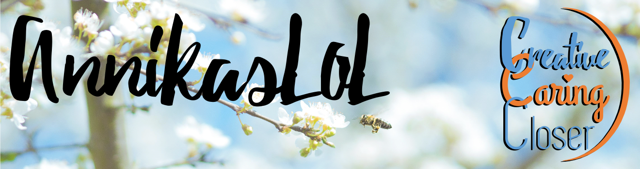
Now it was time to turn my chosen words: Creative, Caring, Closer into a logo.
They all start with the same letter (I like the alliteration) and at the same time each word has a specific meaning. It made sense to me to use three different fonts. After some searching I found three fonts by creative people who offer them for free.

Grand hotel Designed by Brian J. Bonislawsky and Jim Lyles for Astigmatic

After choosing fonts, it was time to decide about colors. I wanted something colorful. I decided to go for Orange (warm, caring, passion) and Blue (my favorite color and a complementing color to orange).
Last but not least, I wanted to combine the words in a way that made them not just words but also a symbol. I tried out a number variations and in the end I did what any sensible person would do, especially a closer; delegate the task to someone who can do the job well. My husband.
He took my input, turned my first attempts into something that looked really professional but not yet like me.
"It looks good, professional, but it is too closed, to sharp. It is not me. I want it to be more airy, more round, less edges..."
After a few iterations it was there. My logo.
On my book release November 16 in Kungälv, you will see the new look. Later on you will see it on the blog, in the newsletters and of course in the coming web shop.
Branding my Storyteller Persona has been educational and fun. And I have a feeling this is somehow just the beginning...
Gillar redan din logo, utan att ha sett den. /Hans
ReplyDeleteSå bra :-)
DeleteThis comment has been removed by the author.
ReplyDelete